

By Elizabeth Wulfhorst |
An avocado. A Granny Smith apple. A freshly mown lawn. Nature provides a bounty of beautiful greens for our visual enjoyment. And green is a color closely associated with spring and new beginnings. That is why Pantone, the world-renowned’ color authority, has chosen “Greenery” as its 2017 Color of the Year.
Pantone calls Greenery “a fresh and zesty yellow-green shade that evokes the first days of spring when nature’s greens revive, restore and renew.” They consider it “nature’s neutral” and “a refreshing and revitalizing shade,” a color which invites us to slow down, breathe and relax.
Each year Pantone selects a color representative of world-wide cultural trends. According to a statement on the company’s website by Leatrice Eiseman, executive director of the Pantone Color Institute, “Greenery bursts forth in 2017 to provide us with the reassurance we yearn for amid a tumultuous social and political environment. Satisfying our growing desire to rejuvenate and revitalize, Greenery symbolizes the reconnection we seek with nature, one another and a larger purpose.”
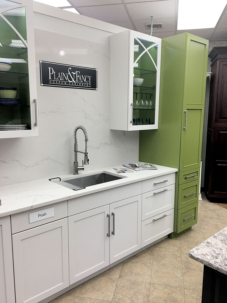
How can you bring this outdoor color into your home? Carefully, cautions Jennifer Jacob, a kitchen and bath designer with Builders’ General Supply Company who has 18 years’ experience working with clients. “I would use it sparingly,” said Jacob. She recommended starting with a neutral palette and adding in green as a focal point. “It goes nicely with browns, whites and grays,” she said.
Jacob said she pays attention to the Pantone color trends and this year is no exception. She sees green showing up as accents, in a special cabinet or backsplash tile.
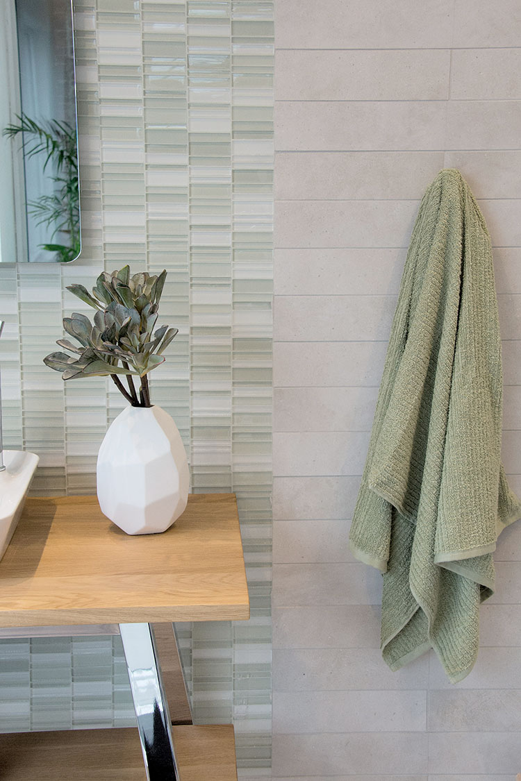
Katie Michael-Battaglia, design director for Nemo Tile + Stone agrees that a kitchen backsplash is a good place to utilize the color green since it “visually pairs well with food.” But it also works well in the bathroom, she said, where “shades of green evoke a fresh, clean feeling.” Michael-Battaglia explained that commercial establishments like spas often use green because it is “known as a therapeutic color.”
While Michael-Battaglia stays current on the Pantone trends, she notes that every client is different when it comes to their tile needs. “Green in general is a very fresh color and is always popular.” Nemo Tile + Stone typically stocks the softer shades of the color, especially in glass and ceramic tiles, but they are happy to assist clients with bold color choices as well.
Home décor elements that are less permanent than tile or cabinetry are a good way to incorporate green if you aren’t sure of the color.
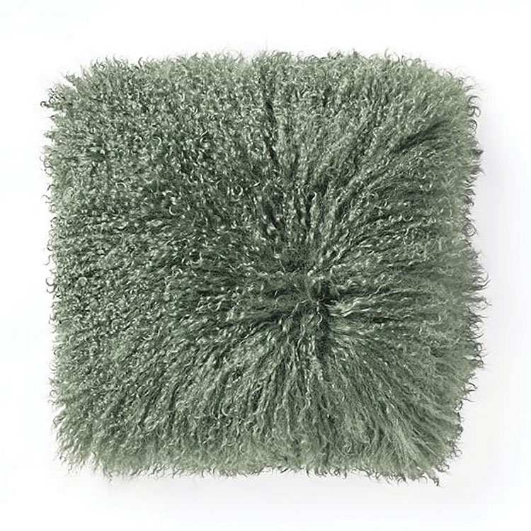
“Green has always been a strong color in interior design,” said Virginia Tesi of Virginia Tesi Design. “In 2017 it is coming back strong, from lime green to emerald.” Bold choices can work in a pillow or throw, or an accent chair or piece of art. Even when it is not the main color, explained Tesi, it is popular in botanical prints or wallpaper. “It’s the color of life so it’s hard to get away from it.”
Tesi recommended adding green the natural way – bringing plants inside. “Its more important than ever to have live greenery in your home,” she said. “As a designer, I have always used live plants to add to the esthetic of a room, layering behind a chair but leaning into the art behind it.”
No matter how you choose to use it, green can be as welcome a color inside your home as it is in the outdoors. “It adds color, warmth and hominess,” said Tesi. “Nothing else can do that so well.”
This article was first published in the Home & Garden section of the March 30-April 6, 2017 print edition of The Two River Times.


